
Creating a website with Divi can be an enjoyable experience by incorporating sections, rows, and modules onto a page. When designing a page, we usually create two or more columns within a row to display various types of content on the left, middle, right, etc. However, it can be challenging to maintain the same height for columns within a row, especially when a column is not showing up on mobile or tablet devices.
A typical scenario of the issue.
One typical scenario of this issue occurs when we attempt to display an image on the right side/column and other content, such as text or buttons, on the left column. To achieve this, we usually set a background image for the right column and enable the “equalize column height” option from the Row Settings > Design > Sizing option, which ensures that the columns have the same height.
However, if we fail to add any module to the right column, or any column for that matter, Divi recognizes it as an empty column and doesn’t show it on mobile and tablet devices, even though the background image is visible on desktop devices.
Why does this happen?
This particular issue occurs because Divi requires at least one module to be added to a column, or it will be considered an empty column and not display on mobile and tablet devices.
To resolve this issue, we will now discuss a real scenario and learn some ways to fix it. Let’s take a two-column row, add a text module and a button module to the left column, and keep the second column empty on the page.
Step 1:
We will begin by creating a page with a two-column row. Our first step will be to add text and a button to the left column. This should give us a layout similar to the example below.
Step 2:
Next, we can add a background image to the empty column by going to the Row Settings > Second Column Settings > Content > Background option. To access the second column settings, we need to click on the gear icon located in the second column.

After clicking on the settings icon for the second column, we can proceed to add the background image through the Column Settings > Content > Background option.

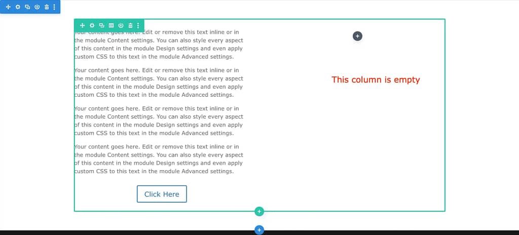
After adding a background image to the column, the second column may still appear empty.
Step 3:
Next, we want to ensure that the second column displays the background image and is of equal height to the left column. To achieve this, we can go to the Row Settings > Design > Sizing option and turn on the Equalize Column Heights option.
Once enabled, the background image will display at the same height as the left column, as shown in the screenshot below.

Enabling the “Equalize Column Heights” option in the Row Settings > Design > Sizing menu will display the background image at the same height as the left column, as shown in the screenshot below.

So far, it looks great as we intended. However, if we switch to the mobile view in the Divi builder, it will appear as shown in the screenshot below.

On mobile, the equalized column height option does not work as expected, and the background image may appear small in the builder view. Moreover, the columns are displayed one after the other, which is the intended behavior in Divi. The following screenshot illustrates how it would appear on a mobile device.

The problem is that the second column appears empty on mobile, as if we didn’t add any images to it. This occurs because we haven’t added any modules to the second column. Without a module, Divi Builder cannot identify column content on mobile and tablet.
Step 4:
There are two ways to fix this issue. The first method is to add a Divider module with a height or minimum height value and hide the module on the desktop and tablet. The second method is to add an image module to the column and hide it from the desktop using the visibility option in Divi.
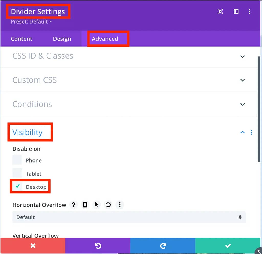
For this step, we will use the first method and add a Divider module. After adding the module, we will disable the Show Divider option and set a height value. The result will look like the screenshot below.

Next, we will add a height value to the module by going to Divider Settings > Design > Sizing option. We will set the height of the module to 400px for the layout.

We will then go to the Visibility option in the Divider Module Settings > Advanced and check the Desktop option to hide the module from the desktop view.
On the desktop, there will be no visible changes. However, on mobile, the Divi builder preview will display the added column with the background image correctly.

And on an actual mobile device, the image will now be visible in the second column. The layout should also appear fine on tablets.

Some common mistakes we make while using column background:
- The first and most common mistake is not adding any module to the column, which results in the background not appearing on mobile and tablet devices.
- The second mistake is forgetting to assign a height value when using a Divider module as a workaround. It is essential to set a height value to ensure that the column background appears correctly on all devices.
Some Frequently Asked Questions About Equalize Column Height:
Question 1: Can I fix the issue by creating a separate row or section?
Answer: Yes, it’s possible to create a separate row or section to show content on mobile and tablet, but it’s unnecessary since we can easily resolve this by adding a module to the column.
Question 2: Is there any other solution besides adding a module to resolve this issue?
Answer: Currently, I am not aware of any such solution. Adding a module to the column is necessary to display content on mobile and tablet.
Final Thoughts:
Utilizing Divi’s equalize column heights option by adding a column background is a great way to enhance the design of a webpage. However, it has certain limitations, such as not showing the content on mobile and tablet devices. But this issue can be easily resolved by adding a module. If you have any further questions or concerns, please feel free to reach out to me in the comments section below.
About Author:
Md Fozla Rabbi has been passionate about WordPress for over 9 years. He is currently working as a Senior Technical Support Engineer at Elegant Themes, assisting customers worldwide with their WordPress-related concerns.